I’m looking at the trend in home ownership versus renting in England over the past 100 years for the January #SWDchallenge.
Britain has been facing a housing crisis for many years now. The government itself officially calls the housing market “broken”. To understand why exactly this is, I’ve spent the better part of two days poring over the history of housing in the country and how various policies over time (and recently lack thereof) have created the crisis that now exists.
While it made for frustrating and somewhat depressing reading, some of the inter-war and post war history of housing is actually quite fascinating. I’ve briefly touched upon some of it in the timeline below. (Click image below to see a large version. The Tableau Public link is at the bottom of this post.)
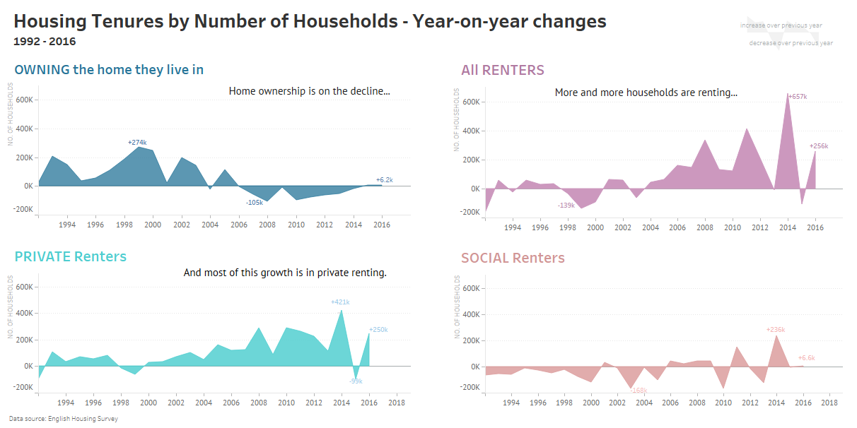
Some pretty stark trends there. While this timeline focuses on relative percentages of households over a 100 year period, it is also useful to have actual numbers in context. The charts below show annual changes in total number of households owning houses or renting. (Annual figures are only available since 1991.)
In the same years that the annual change in total number of owner occupied houses moved into negative territory, the total number of households renting has simultaneously registered massive annual increases.
For the more curious, here are some great links which give more insight (with some very interesting charts) into the history of housing in England and how the current crisis came to be.
- The Guardian brilliantly explains the housing crisis in six charts here.
- BBC News carries a very interesting history of social housing.
- A brief history of the Right to Buy and it’s effects on social housing here and here.
- Make up your own mind about how helpful the ‘Help to Buy’ scheme is. To start off, read this, this and this.
- These photos of prefabricated homes constructed as temporary post-war housing and which were still being lived in 70 years later are quite heartwarming (probably demolished by now though).
- ‘Why are more young people living with their parents?’ by ONS Digital focuses on housing issues among young adults.
- This article from the ONS Digital discusses current issues of demand and supply in the housing market.
- The 50th Anniversary Report of the English Housing Survey provides details of major findings from their surveys and a brief outline of housing policies since 1967.
See the timeline on Tableau Public here.


