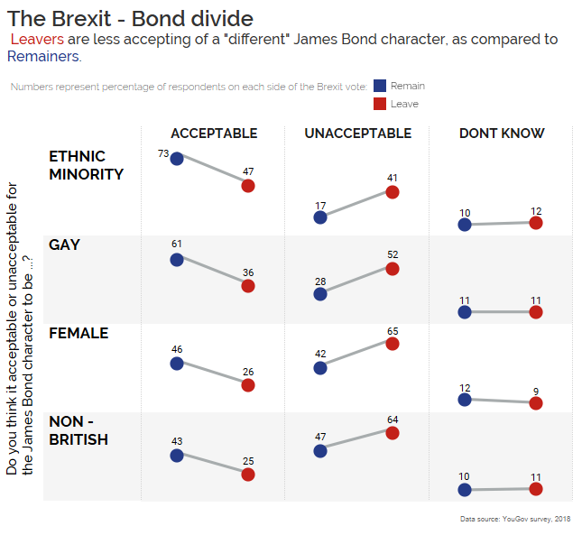
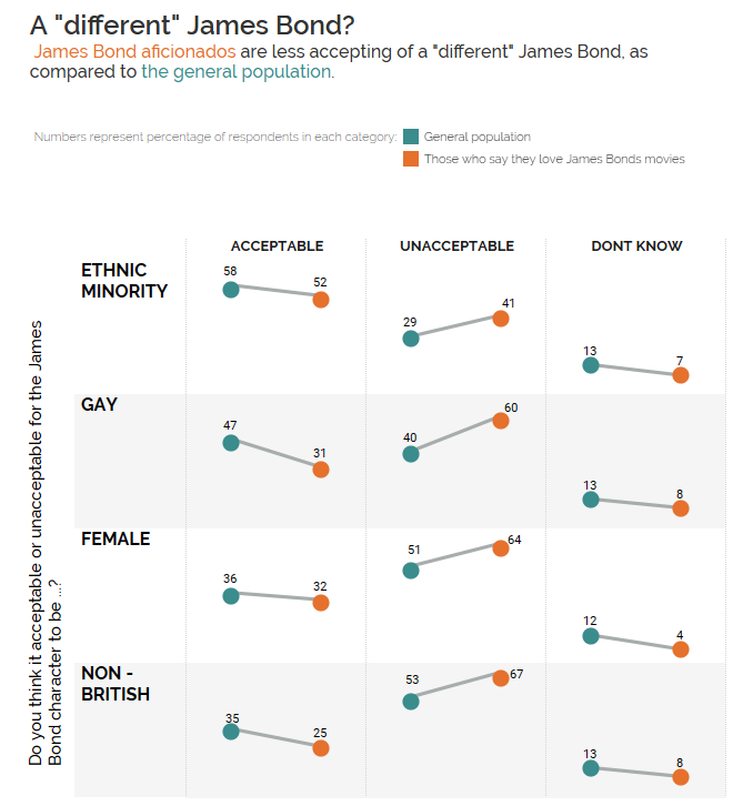
My #MakeoverMonday for the chart here, using survey results split by Leave/Remain support in the EU 2016 referendum here.

(Because it was my first time and I didn’t read the rules, I did a makeover of the original chart first.)

What I noticed when I swapped the data and changed the colours in the original chart (teal and orange) to Vote Leave and Remain campaign colours:
Colours have a massive impact on the look and feel of charts.
I was quite pleased with the teal and orange version – it reflected my aesthetic and looked “clean”. But when I changed the colours to red and blue, it just didn’t seem right to me. it looked quite overdone in fact, nothing I’d really give much thought to myself.
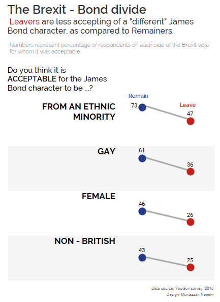
Update:
Based on feedback from Eva and Charlie, I’ve updated it to focus only on agreement.

